Written by Michelle Hudlow, Dir. of IT and Communications
We are very excited to announce that Holy Name of Jesus has a new logo and new color theme. Starting Jan. 1, 2018, with this newsletter, all of HNOJ’s digital and print communications are sporting a refreshed look.
Determining the need to update the logo and the subsequent process has been a yearlong endeavor by the communications committee and a group of HNOJ staff.
Why did we change the logo?
Good question. Let me take you through a short exercise that sums up this process.
If I were talking with you and your family in person right now I would ask you:
In one word, how would you describe Holy Name of Jesus to a friend who has not attended HNOJ?
Take a moment now to think of this word…. 10, 9, 8, 7, 6, 5, 4, 3, 2, 1… ready? When you are ready continue reading.
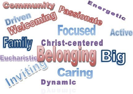
Was one of your words shown in the left column? These words are how dozens of people have commonly described HNOJ to me – in one word - over the last year.
Now, look at the branding on a pre-January 1 bulletin or newsletter - or to the right.
Does this branding represent who HNOJ is today? Refer back to your word, and the words above. When several groups of parishioners, of all ages, were asked this same question, and they all strongly agreed that the current branding does not accurately represent HNOJ today. One person even said of our current logo and colors “low key, taking it easy.” Holy Name of Jesus is the sum of all of you – the parishioners – who are an energetic, welcoming and supportive community. Our publications should reflect who we are in our marketing and communications.
About HNOJ’s New Logo and Color Palette
Holy Name of Jesus worked with a local company, Fuzzy Duck, to design the new logo. Do you recognize the shape of the logo? The iconic cross tower is at the entrance to our church. This part of the image is immediately recognizable to anyone driving up to the building. The cross quickly communicates that we follow Jesus.
The waves under the image are fluid and versatile, allowing it to support the mission and vision of Holy Name of Jesus, as well as the goals of many ministries. To someone who lives in the area, the waves might represent the familiar water of Holy Name Lake. Water also symbolizes the Sacrament of Baptism. The waves also represent the flowing of the Holy Spirit into and through us.
The vibrant blue color often invokes a relaxed mood, but also is welcoming and open. However, the logo looks very nice in black and white as well. We can also change the color for specific advertising, such as to gold and orange for Fall Festival, purple for lent, etc. But for everyday communications and advertising, it would stay the two-toned blue.
The colors intentionally coordinate with the schools branding. During the decision making process, people often were drawn to the school colors. Synchronized colors will benefit joint advertising materials.
Frequently Asked Questions
Looking at the bulletin archives, the bulletins in 1989 used a drawn image of the building on the cover. In 1998 it looks like a basic cross became the common design on the return address only. The previous logo shape appears in 2006, with digital files showing a date of 2005; including the Know See Be image for the vision statement.
The mission and vision of HNOJ will not change. It was felt that the mission and vision are still at the core of what we do at Holy Name of Jesus.
The school colors were attractive to many people in the process. The new parish branding colors emulate or coordinate well with the current school branding pallet. This will make it much easier to coordinate mutual advertising. Changing the school logo is not off the table, we just wanted to take some more time to review the options.
Other ministry logo’s may also get a refresh throughout the year, for example we are looking at the Fall Festival logo.
HNOJ is currently taking bids to determine the cost and scope of replacing the outside signs. Some ideas that have been put on the table include an electronic sign that would replace the need for vinyl banners at the entrance. However, there is no money currently budgeted for this expense.
A special thank you to current and previous Communications Committee Members for their expertise, time and participation: Colleen Bosold, Dan Viehman, Paul Hess, Jennifer Spinler, Susan Spoden, Nate Reinhardt, Martha Laurent and Michele Schatz.
If you have questions, please feel free to give me a call at 763-233-0250 or email [email protected].


